
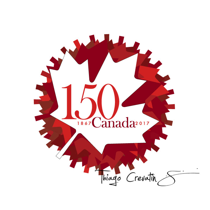
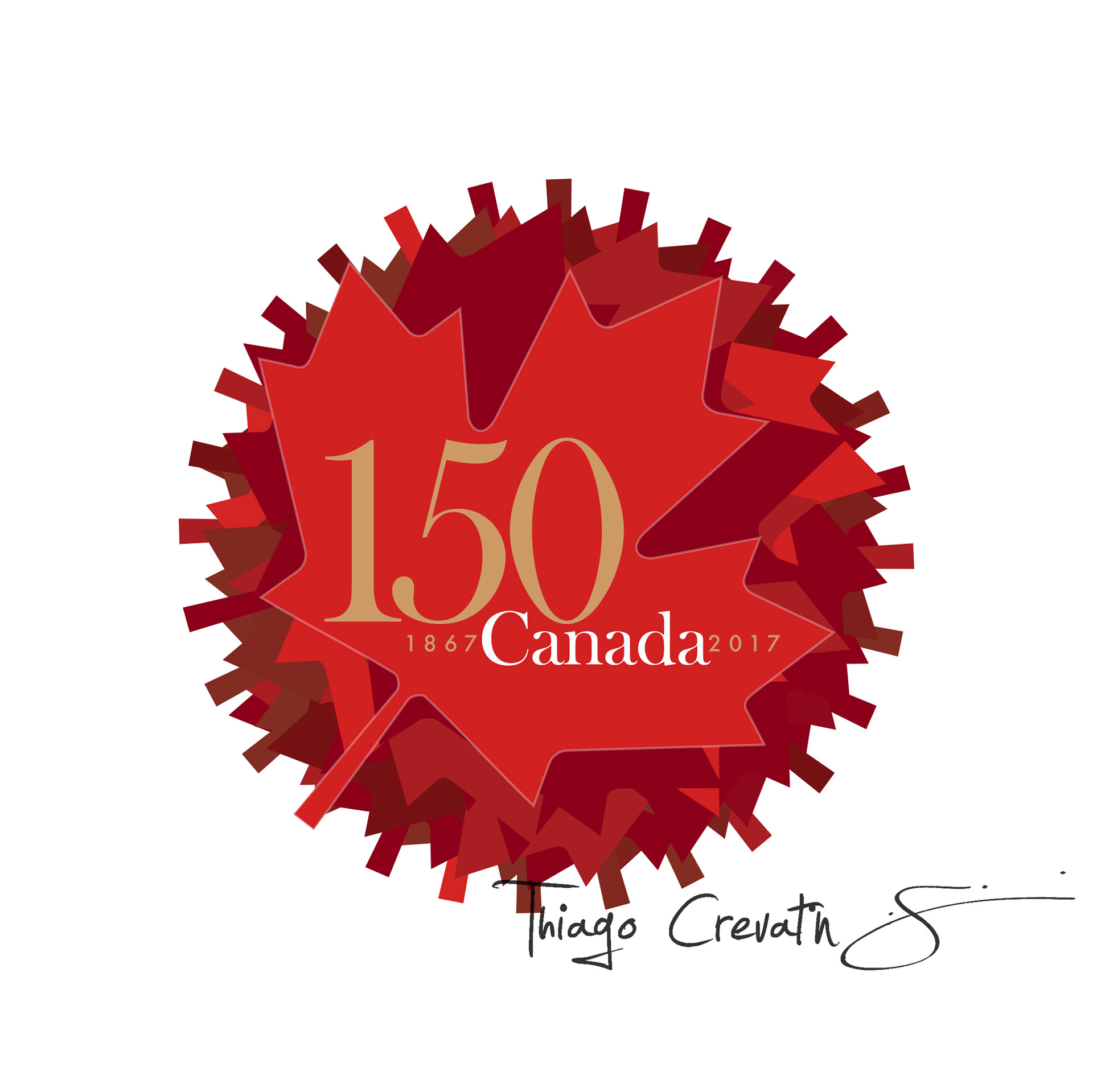


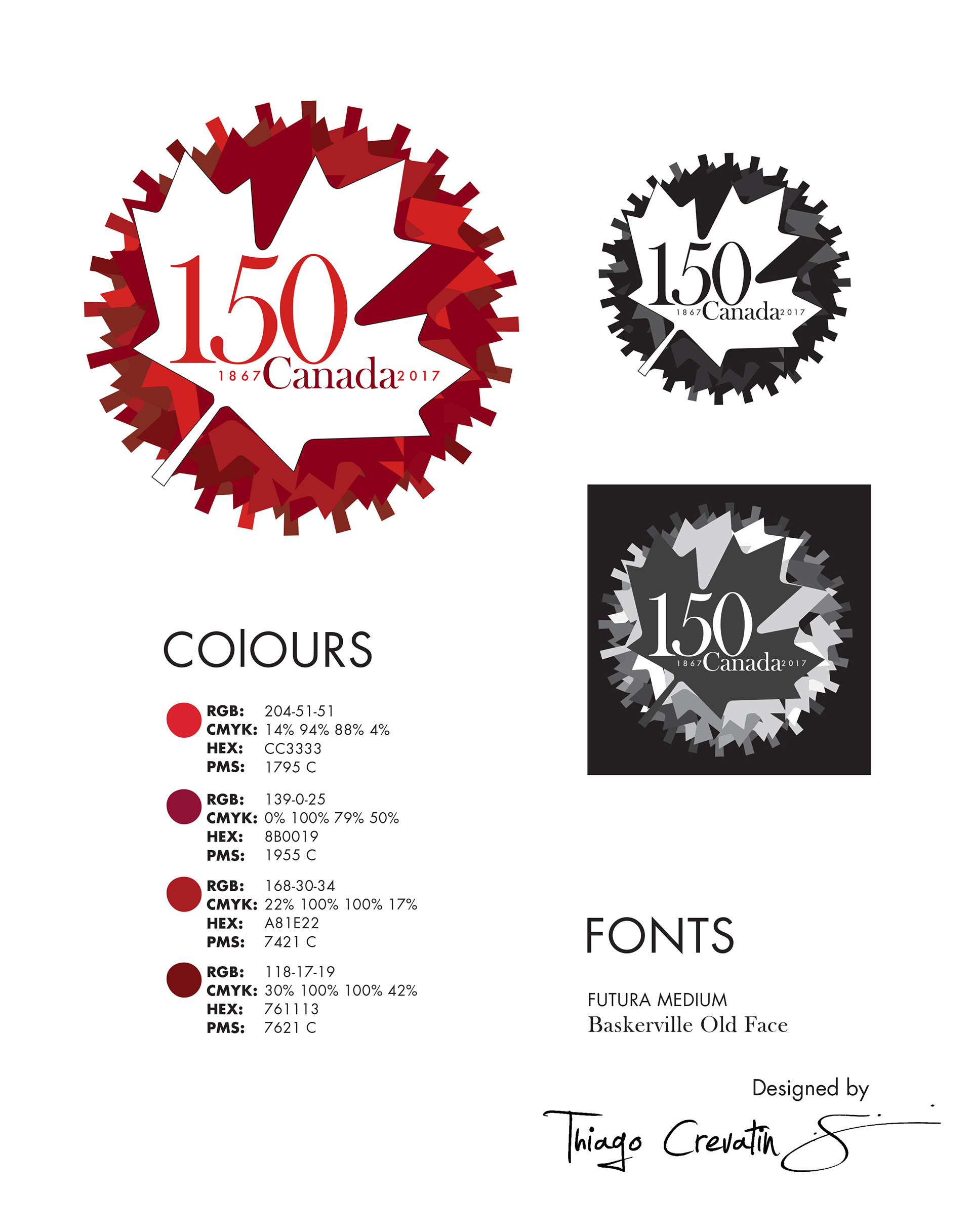
The 150th Canada Logo was designed to celebrate the 150th Anniversary of Canadian Confederation. The logo is a emblem style, It was designed in this way to pass a governmental sense and credible. The design created was inspired by Canadian Spring and Autumn, It means that the composition of the Maple leafs in different shades of Red were created to give a sense of time and rhythm. The maple leafs dropped and the main maple leaf in white color to refer a peaceful, diverse, and pacific nation.